Project: Project Success Homepage Evolution, 2020
My role: As Communications Manager, I provided strategic guidance and served as the key Project Success point of contact for this project in collaboration with our web development partner agency and our program staff. I acted as the liaison between our staff and agency, translating staff need's and ideas to our agency partners while using my own experience to inform content best practices and adherence to brand guidelines. Similarly, I brought agency feedback to our staff while ensuring we could complete this project within our time and budget. I also wrote all content and implemented all changes in our Wordpress CMS once our new homepage had been fully developed.
Audience: Minneapolis Public Schools students, grades 6-12, and their families.
Goal: As a privately funded nonprofit, Project Success' website was originally designed to appeal to two audiences of equal importance: Students and families who participate in our programming, and prospective supporters (including funders, community leaders and partners). The foundation of our programming is in-person, experiential learning. When the COVID-19 pandemic forced all students into a distance learning model, Project Success developed a robust set of virtual programs to meet students where they were — online.
This shift required a reimagining of the Project Success homepage with a heightened focus on our student and family audience, making virtual programs easy to find. At a time when many other organizations put their programs on pause, we needed our audience to know we were still here. Our website became the most important tool to drive families towards our newly reformatted programming.
Challenges:
- This project needed to be completed on a very short timeline during the summer of 2020, and in many cases program plans hadn't been finalized yet, meaning we were planning to showcase and promote programs that were not yet fully realized.
- The number of stakeholders in this project was immense. It required feedback from more than seven program managers, each managing a program with unique needs and considerations; the Project Success leadership team of four directors; and an outside web development agency team of project managers, UX and graphic designers.
Strategy:
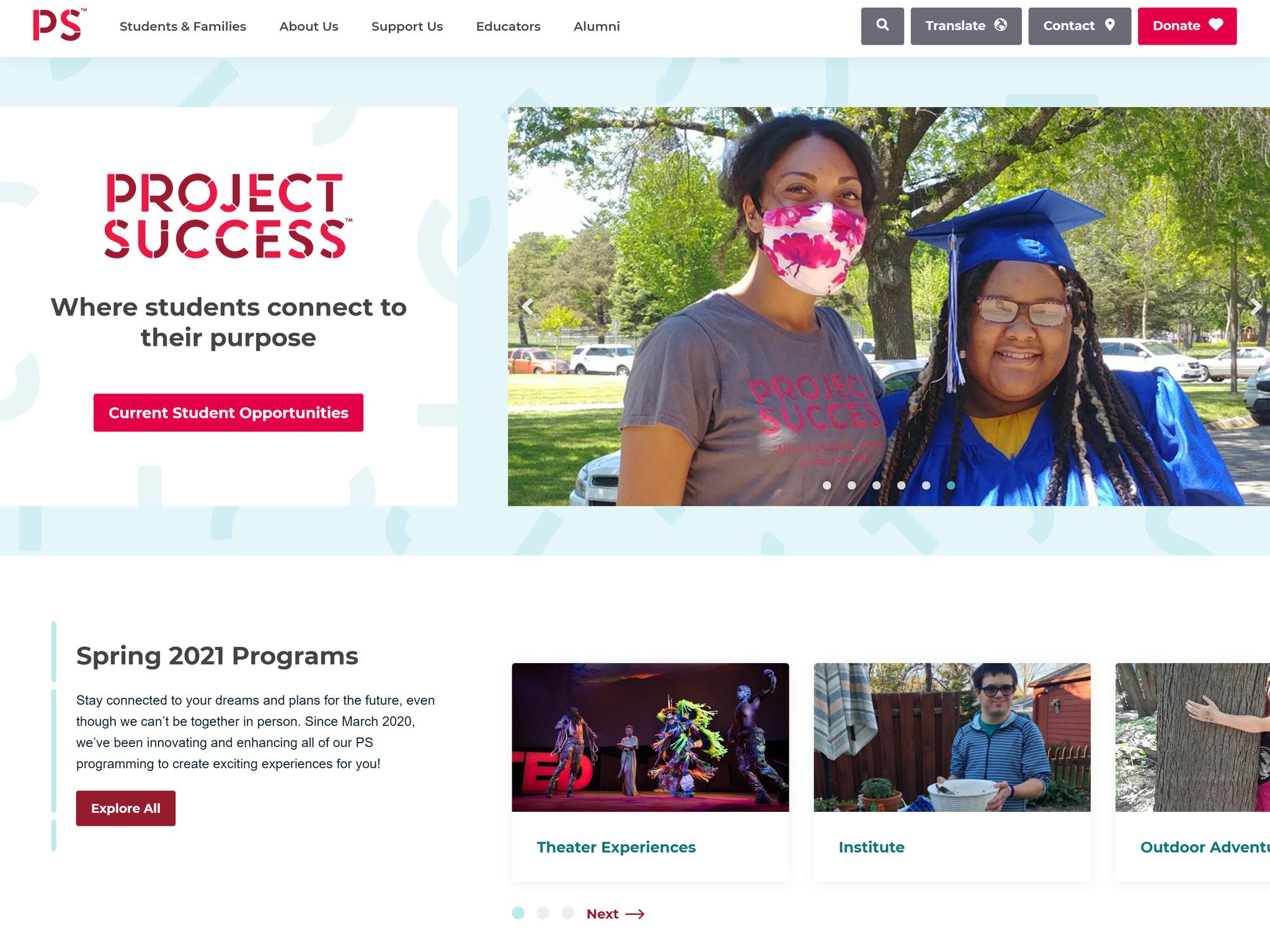
- We needed a way to visually represent our Students and Families as our most important audience and minimize the time it would take them to get to a program registration page. Thus, we moved the "Students & Families" section of the top navigation to the most prominent position (furthest left), and renamed "Get Involved" to "Support Us" to more clearly reflect the contents of those subpages (ex. Volunteer, Make a Gift).
- Getting students to view our programs was our key objective, and we wanated that call to action to be as prominent as possible. We changed the main button color to a brighter red from our style guide that is used only for the most important CTA's on our website (ex. the "Donate" button). We also changed the language from "Find a Program" to "Current Student Opportunities," which spoke more accurately to the audience we were targeting and the timeliness of the content they would find when clicking through.
- Our program component description pages, previously featured on the homepage using language targeted towards supporters and donors, was removed. This section was replaced with a carousel and a short blurb that gave students easy, one-click access to register for virtual programs.
Results:
- By 2021, our program pages began to consistently exceed the past year's traffic, month over month. Collective time on page increased by over 50 percent, reflective of students' interest in, and interaction with, our virtual content.
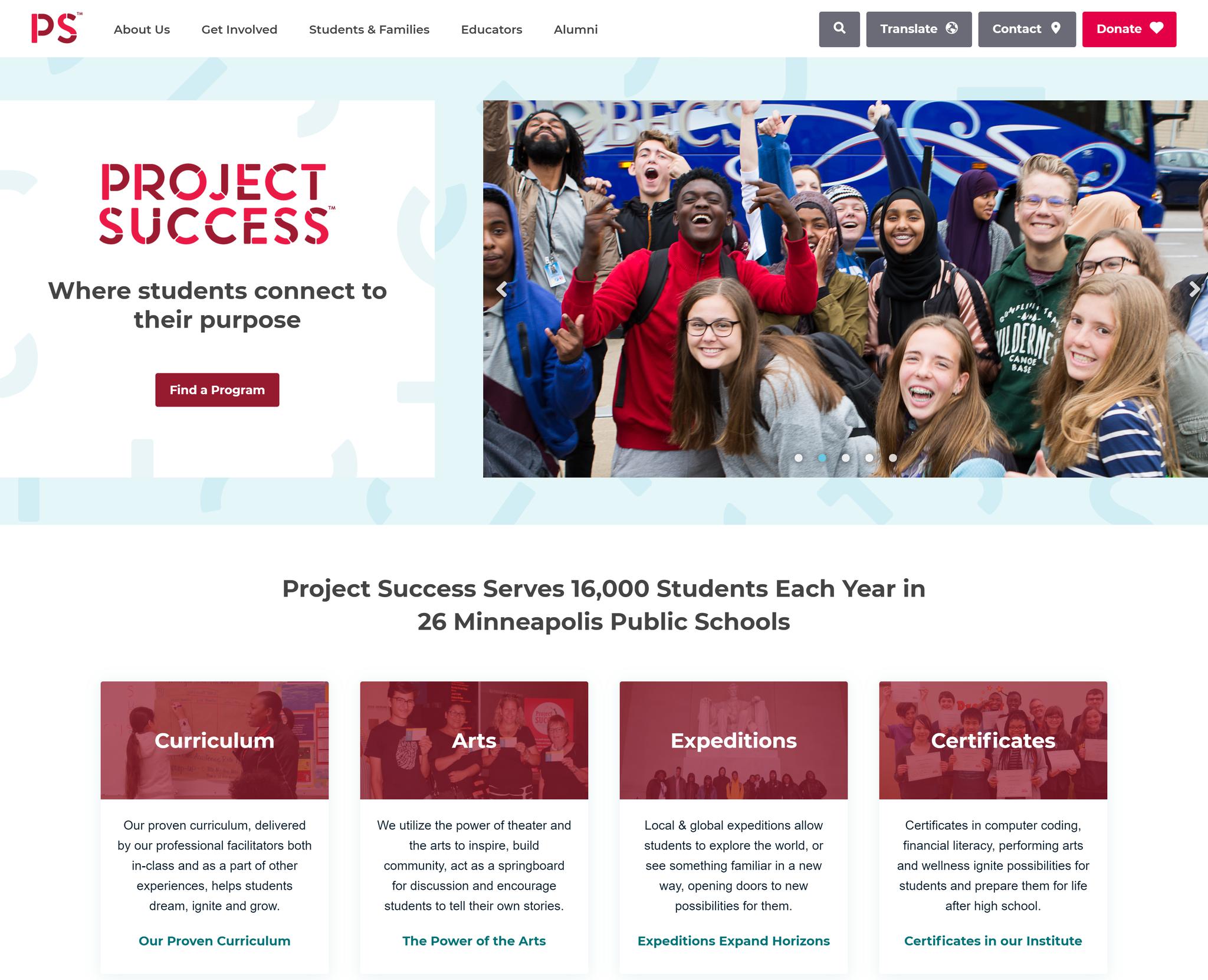
BEFORE
AFTER